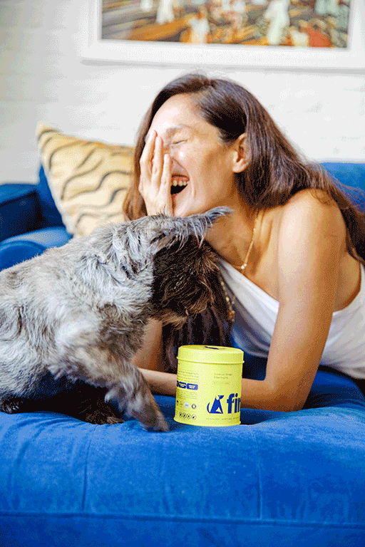
Trusted nutrition for your trusty companion
Finn is a contemporary pet wellness company that offers your loyal friend with all the required resources to lead a happy and healthy life. I was Finn’s Visual Designer and Creative Director for four years. Here are some of the projects we worked on.
-
Creative Direction, Packaging Design, Web Design, Photography, Visual Design
-
Randall Stainton, Laura Meschini, Kim Hengel, Colin Derreta, Nick Michlewicz
-
New York
-

A Candle For Dog Lovers
A Candle For Dog Lovers
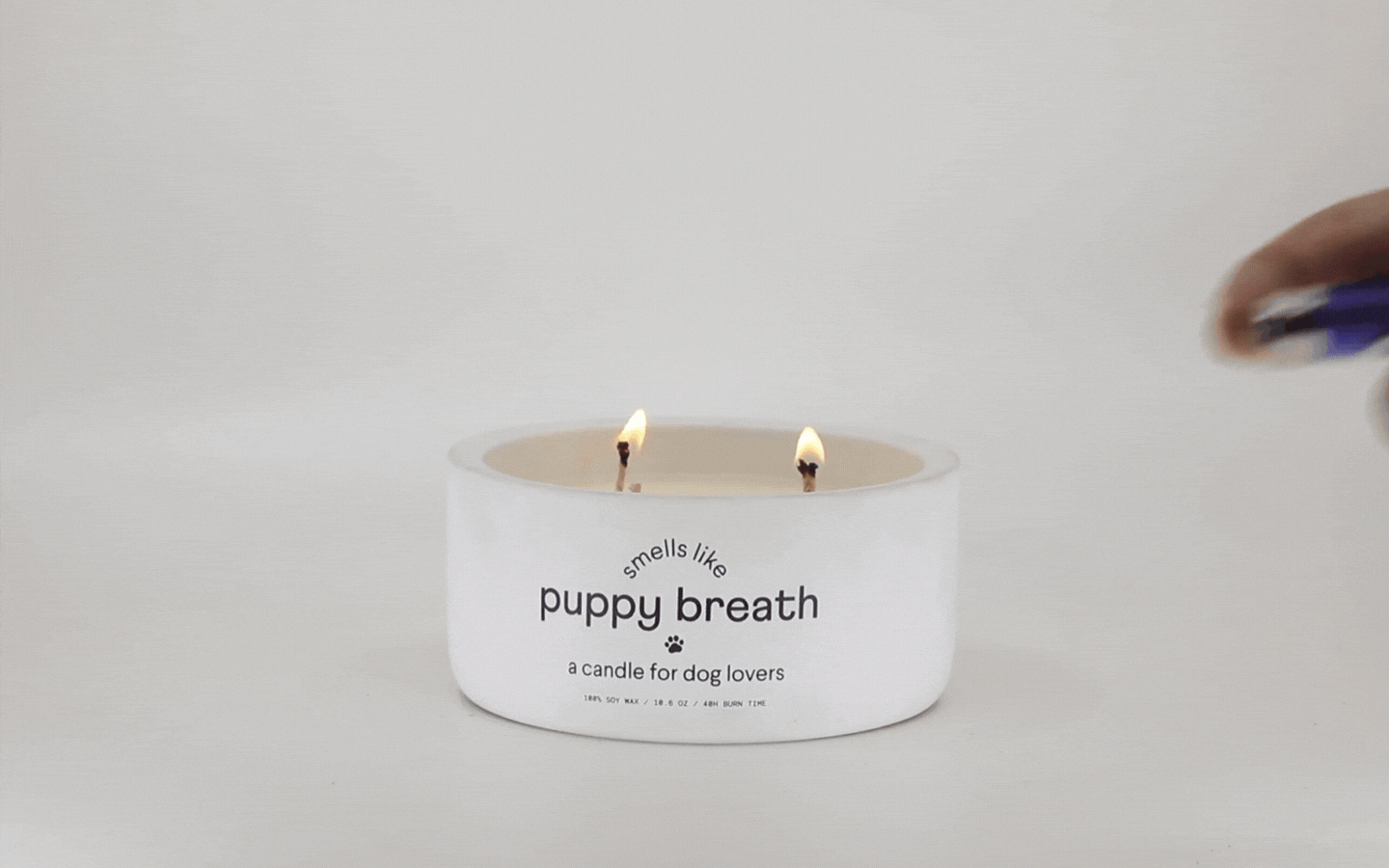
Puppy Breath Candle
Finn releases a unique product to celebrate dog parents as part of their annual holiday tradition. The Puppy Breath candle is a special creation designed to capture the essence of early puppy parenthood and bring back fond memories of that particular time.


For Puppy Breath, we aimed to deviate slightly from the norm and inject some playfulness into the design. Who doesn't love a bit of puppy chaos, after all? We brought back Finn's illustrations and made them the centerpiece of the packaging, intentionally creating a chaotic look to celebrate the many different, colorful, and branded elements that Finn showcases across its portfolio.


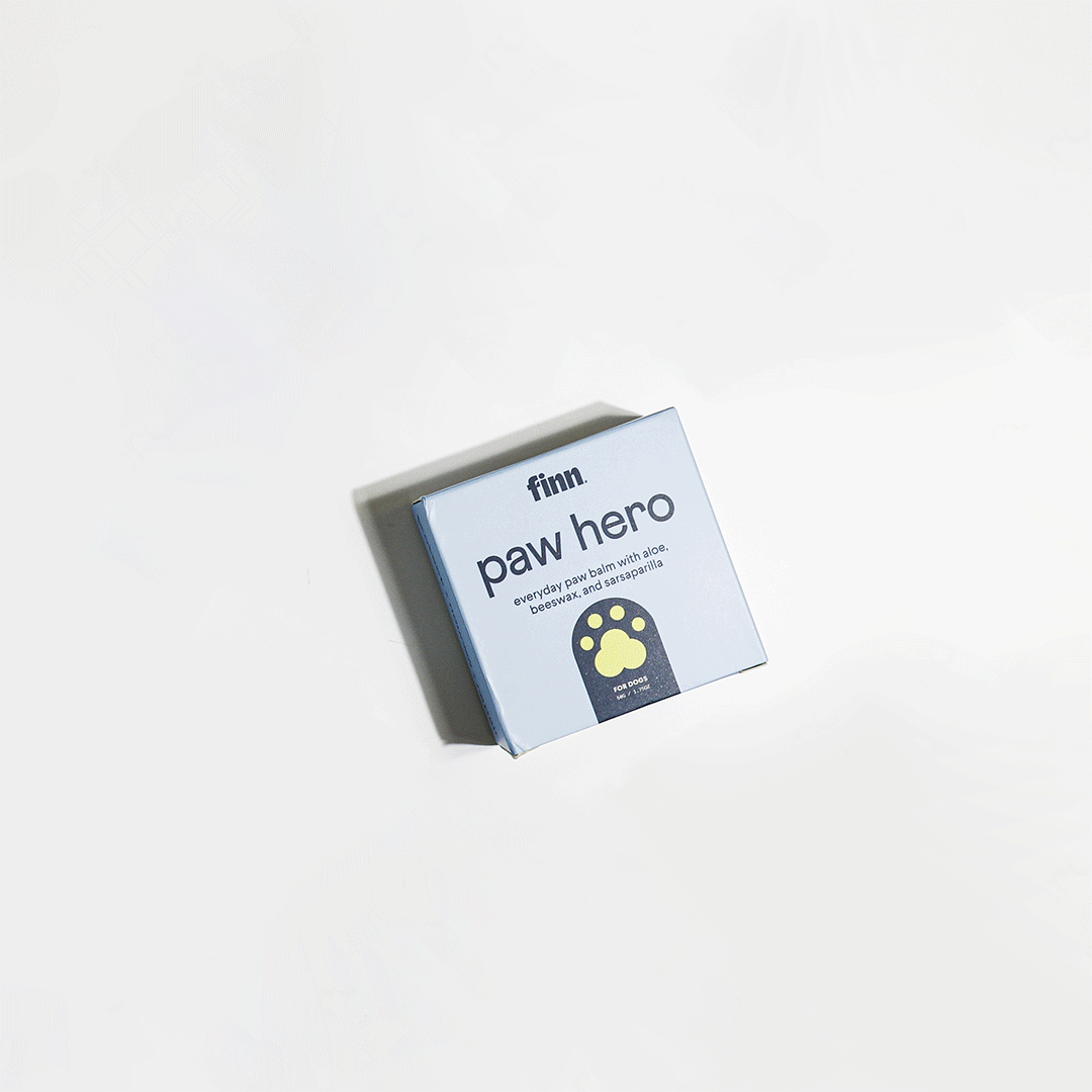
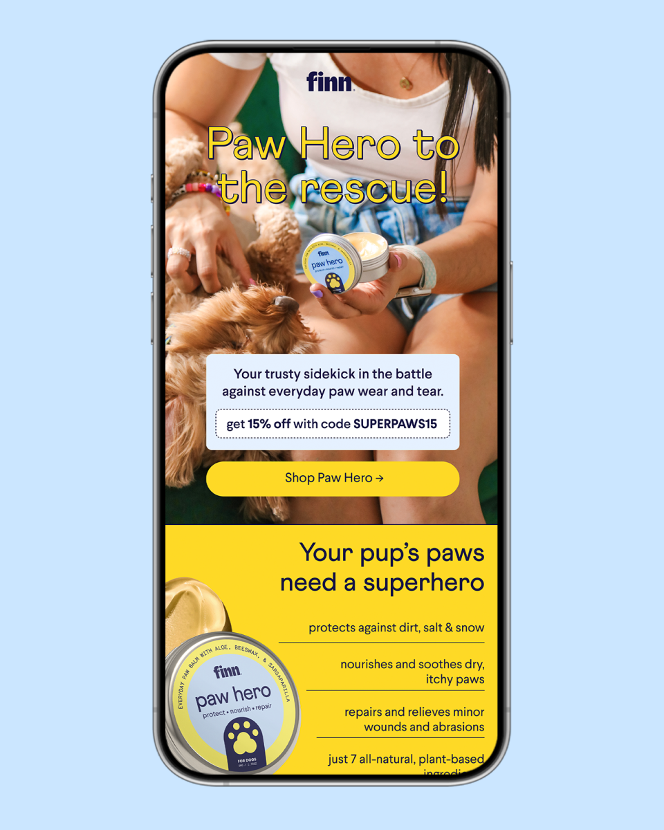
Paw Hero
Paw Hero is Finn’s first skincare product, which sets the beginning of an expanding line. We worked on a distinctive creative direction, opening the brand’s packaging design to more elements and typography play so it feels more relatable to its human counterpart.


We came up with a unique concept of showcasing Finn's dogs as superheroes in a fictional city. We aimed to create a fun and engaging story that would resonate with our target audience.


When Finn decided to expand their product portfolio beyond supplements, we faced the challenge of preserving the simplicity of the brand's design while creating a unique identity that could be carried over to their new line. To address this challenge, we capitalized on the dead space available on both the tin and the box to inject product information.
To give the packaging a touch of softness and calm that is characteristic of human skin care products, we opted for a color pairing of light blue and yellow, which complemented their signature blue. This color combination not only added a subtle visual appeal to the packaging but also helped to distinguish the skincare line from their supplement products.


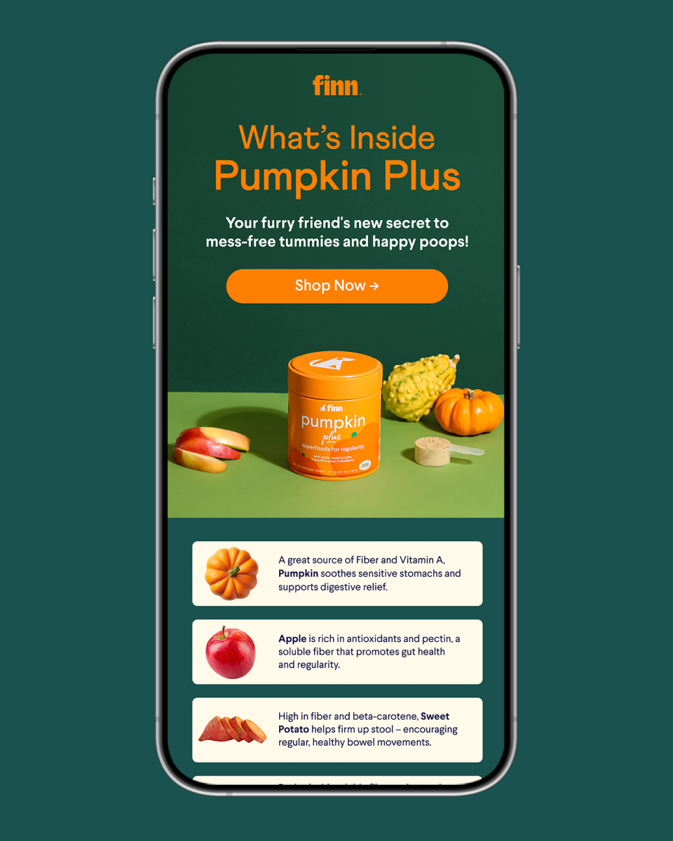
Pumpkin Plus
Pumpkin Plus is the initial product in their new line of superfood powders, marking the beginning of a new design exploration for the brand.


We added illustrations to our packaging for the first time. It was crucial to create illustrations that could be expanded and create a good balance between other upcoming products and the brand illustration system. It is vital to note that Finn's superfoods powders are unique as they focus on the hero ingredient instead of product benefits, so the design needs to reflect this new approach and feature such information more prominently.

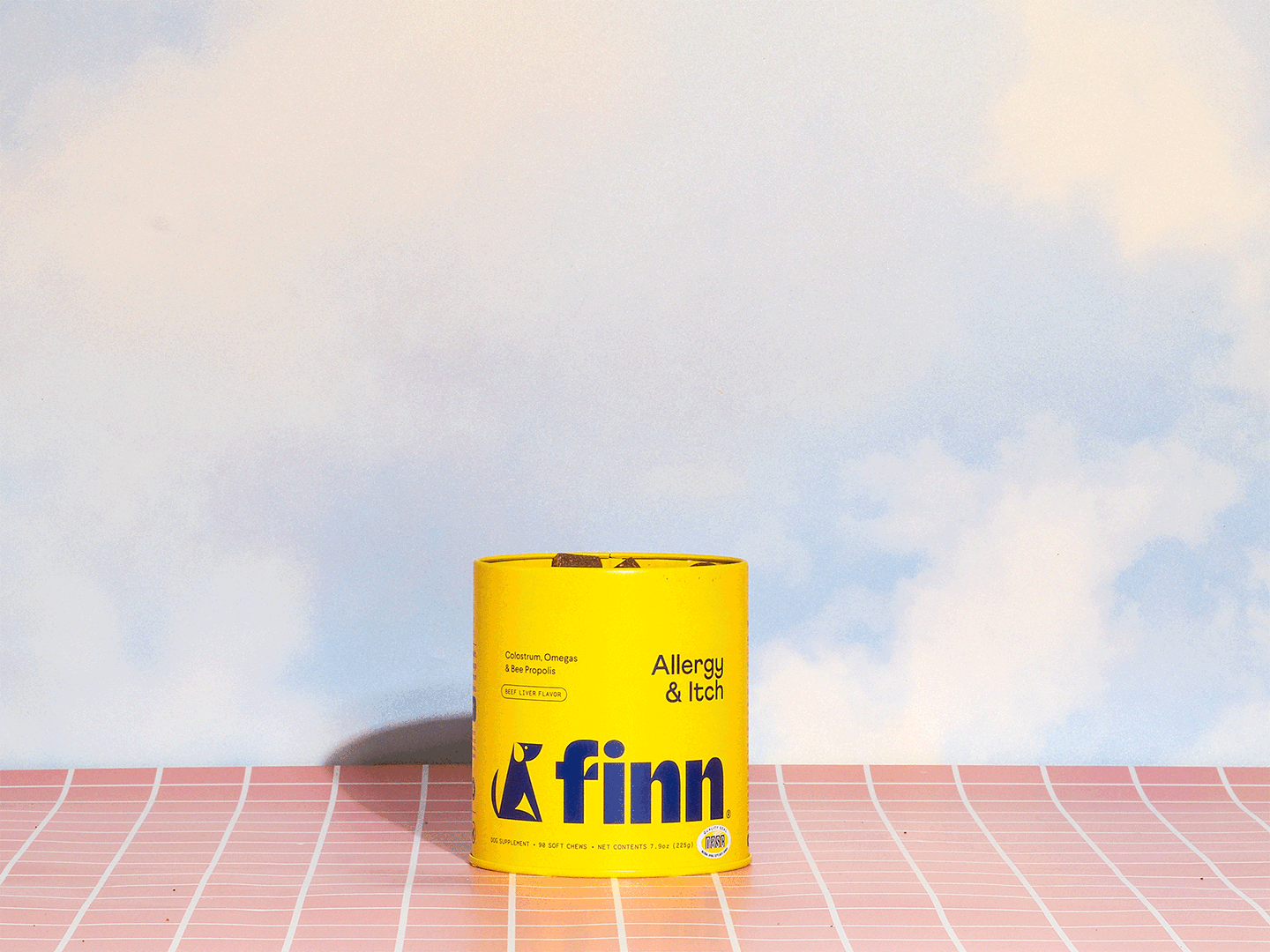
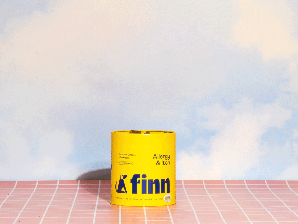
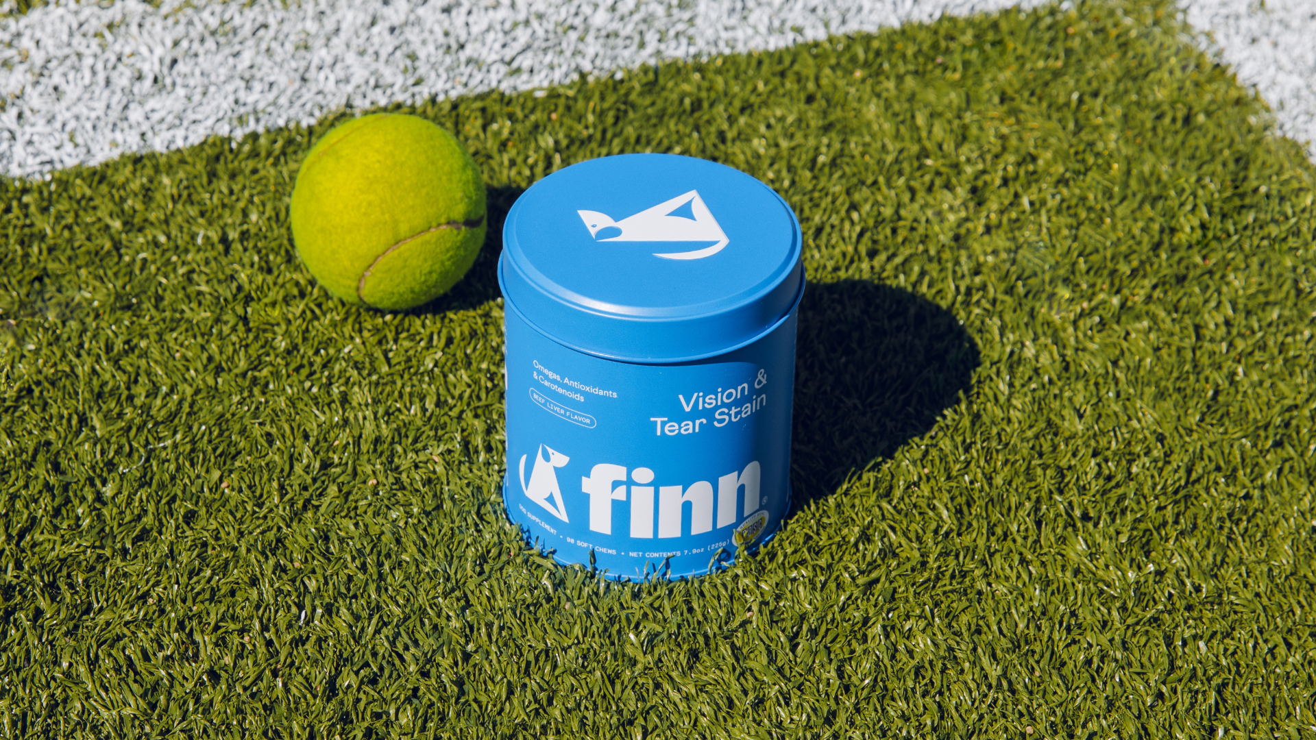
Vision & Tear Stain

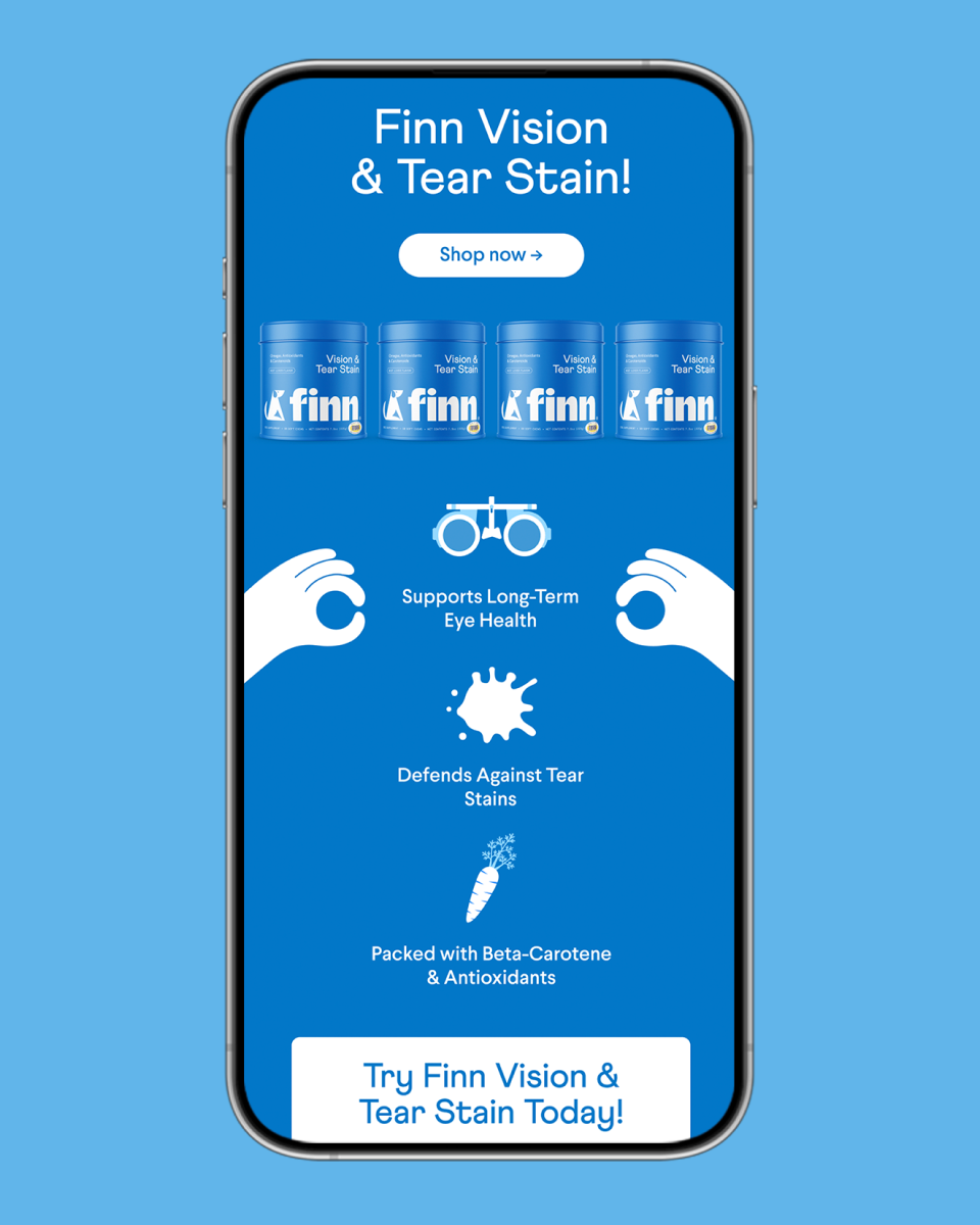
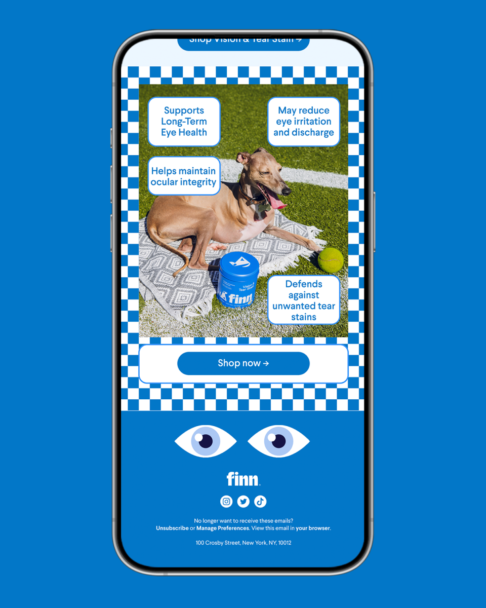


Creative Campaigns


Email Design
Finn emails have been featured on Really Good Emails and Email Love.

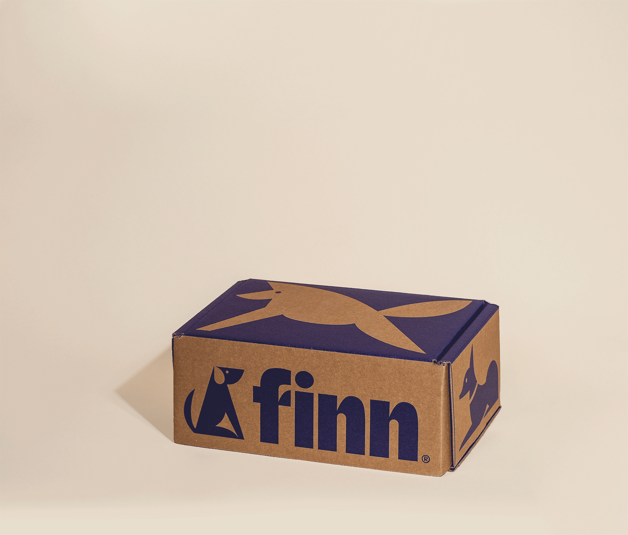
Unboxing Experience


Content Creation